I sometimes find quantitative, number- and statistic-based data to be like porcupines: prickly, pointed, and good to look at but not so good to touch. But for the past week, our class has been using a lot of data, and I like it. In groups of two or three we were assigned a city where we could study pollution emissions in relation to things like racial distribution, poverty, and median household income. We used GIS (Geographical Information Systems) to cross-reference data from the 2000 U.S. Census (2010 data is not accessible yet, which is frustrating) and from the U.S. Environmental Protection Agency (EPA) on a map of the urban area we were studying—in my group’s case, Baltimore.
GIS makes it really easy to visualize socio-spatial trends. In some cities, all of the polluting facilities run along the highways and are clustered near transportation corridors. In others (e.g. Chicago, Houston, Phoenix) they are clustered in Latino neighborhoods. In Baltimore, the pattern is actually contradictory to what we might have expected based on theories of environmental inequality (which are mainly about how race and residential segregation, even more than socioeconomic status, have an enormous effect on a populations unequal exposure to environmental pollution and hazard). Polluting facilities are concentrated on the outskirts of the city, where the population is mainly white and middle-income.
There’s a theory for why a pattern like this would happen and buck the national trend of race-based environmental inequality. It’s called spatial mismatch, and it happens when whites move industrial centers and manufacturing jobs away from blacks in the inner city. The access to social goods—in this case, job opportunities and a nice waterfront—outweighs the negative side effect of exposure to pollution. Interesting, isn’t it? So that’s how data can be awesome: When you can point to a map and make your point visually, undeniably clear. The crux of sociology, and especially environmental sociology, is that individual problems are not just individual problems; they are almost always indicative of some larger social pattern(s). To only look at individual cases is turn away from extremely important social causal factors and processes.
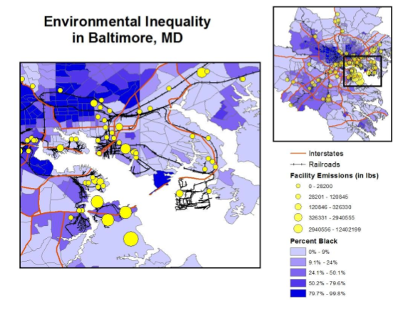
Anyway, here’s a map we made. The yellow dots are pollutant emissions and the gradient from dark purple to light represents mean percentage of the population that is black. Cool, right?