Performing all on one stage for the first time ever!
These three different options allow departments to push three different amounts of content.
- Placemat is pushing the least amount of content, and has the most “ooh la la” photo-excitement.
- Bikini is the middle ground – note that these three bikini examples use the spaces in various ways.
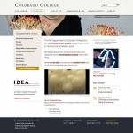
- And three-column (Boo, Naming Committee!) is by far the newsiest of the designs, with lots of content – it depends on a photo really only for texture.
One additional note about color:
You’ll notice a few different highlight colors on these mockups. I like to let folks choose from an approved set of highlight colors – ones that we have agreed upon (and coded) in advance. Sometimes this is just the thing that makes page editors feel awesome, other times they just want it to be the school colors, darnit! Well, both are very possible… 🙂
Looking forward to hearing your thoughts about all of these!
Janie
Placemat
Bikini
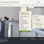
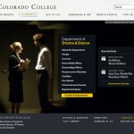
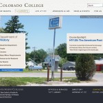



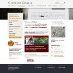
i found the bikini option the most elegant of the three designs. it feels informative and visual without being overwhelming. it’s helpful to see the drama/dance mock-up and the bikini layout seems to work really well in it.
To answer the question a couple people have asked (why the bikini is named the bikini) and a few more details from Janie:
• The Bikini is so named because it has a top and a bottom, of which the top can be interchanged easily. (It’s like a Lands End bikini.)
• The Bikini features photos in the top area that could be changed, ideally, as often as new ones are available. They can vary in height, but I’ve used roughly 400px as a max, since that’s the dimensions of the wonderful photos that Scott [Johnson] sent over.
• The bottom section is basically three columns, with the one in the middle always containing the navigation. • This design is ideal for departments that, despite what they might believe, actually have a lot of really great photos! The location of the nav is very unobtrusive, and can accomodate lots of different types of shots – groups at a conference, students in lab, stock photos of molecules, etc.
Moving forward to the Placemat!
• The placemat is designed to be a very visually striking layout for departments that don’t often have fresh, great photos.
• But wait, the whole design is a photo!
• Yes, it’s true! – this is made in such a way that we could choose a *few number* of great photos, and then not worry about them more than three or four times a year. While this normally isn’t as “dynamic” of an approach as we would usually suggest, it seems to fit the pace, schedule, and size of some of the departments we’ve spoken with.
• So the Placemat uses one large photo, and then puts two additional elements on the page – one is always the navigation, and the other is a content area of the departments’ choosing. I’m attaching a few examples, including one with a calendar blurb and one with “intro text”.
The three-column layout is ideal for departments who prefer a homepage that shows a lot of activity. Econ. comes to mind as a department that currently produces a lot of content and might like the three-column layout.
Do we have any info or feeling for how many prospective students vs current majors visit the departmental pages? My daughter, who is looking at colleges now, says that she has looked very little at departmental pages. I have no idea if this is typical.
If a significant number of prospective students do visit these pages, then I think the showiest, i.e. placemat, is best (with frequent updating of photos). If not, then I prefer bikini since there is more content on the first page. Three-column is boring and not visually attractive.
I liked placemat. Not a fan of three column because it comes across as really unoriginal.
I can understand why one might like the Bikini mock-up for Drama & Dance- it’s far superior to the standard three-column site design- but I love the Placemat template, which is so visually arresting. Indeed, Cornerstone is itself visually arresting, and this seems like a way to transmit its dynamic character to individuals who haven’t had the chance to visit in person. I also like Placement’s clean look, which presents essential information in clear, easily accessible categories.
By the way, I do think that many people look at departmental webpages, including, but not limited to prospective students. If a certain class of prospective students takes the time to travel cross-country and meet with department faculty, I’m sure they will also look at the site. But the webpage is more than that- it’s the masthead for current students, alumni off-campus, and faculty from conceivably anywhere.
I really like placemat for its nice, clean appearance and easy to read, bullet format. I like bikini, for dynamic atmosphere and am not a fan of three-column as it’s so content-heavy. Would visitors stay around long enough to read the entire page?
I like the placemat design most, now, and “bikini” second.
Hello friends,
This is Janie, one of the two designers from White Whale – Jason and I have been following along with your comments and questions – thank you so much for looking, listening, and responding!
I’m going to address as many things as I can here on the blog, but I’ll also be on-campus April 11th and 12th – make sure to find me if you want to talk specifics!
First, to answer a few questions about the roles of department sites: a prospective student won’t drill too deeply into any one department when she’s still narrowing down her top schools. But once she makes a list of those three favorites, it’s usually the department sites that have the opportunity to answer the question, “What’s it like to *really learn* here?”
Current students want to use department sites for a number of practical reasons: to browse available block 7 courses, look up requirements for the major, or check out a faculty member prior to sitting-in on his first class. However, this is a great place to expose current students to the great work that alumni and faculty are doing – recent publications, grad school victories – even just as sidebar elements, these things can help build community pride at CC.
And finally, departments often contain the “professional homepages” of faculty members. Colleagues, researchers, and collaborators visit department sites looking for everything from phone numbers to grant awards. Faculty members need to have simple ways of keeping their academic content fresh and relevant.
We want department sites to look active and engaging – and to reflect their unique personalities! CC has some pretty lightly-staffed departments, and the three-column layout (from above) might not be the right approach for those smaller groups. But look at all the information that the Biology Department has on their current homepage! – we want to accomodate as much energy as people are willing to give us (without twisting any arms!).
Finally, we always encourage departments to incorporate a “department switcher” – a quick dropdown that lets prospective students bounce between, say, Anthropology, Sociology and Psychology – without having to navigate back up the chain to Academics.
Okay, I look forward to hearing more, and to seeing many of you soon!
Janie Porche
White Whale Web Services
I like the looks of the Bikini layout most – it shows a good amount of information without being overwhelming. The Placemat doesn’t have quite enough information for the Geology Department.
Do we have to all agree on one format or could each department choose from the three layouts?
Hi Mandy!
Ideally, each department could choose the one that suits them best! Of course, there will also be inside-page designs that follow these – which will have a pretty standard layout that can accomodate many types of content – course listings, faculty profiles, etc. But to answer your question, yes!
I think the best one, the cleanest and most simple, is the placemat design. I prefer the middle “placemat” with the dark background because it has less of the scattered bulletin board look. The bikini would be a distant second choice; the three column version seems way too busy to me.
Placemat and Bikini are both nice, but PLEASE stay away from three column. it is boring and has little texture
Great! Thanks!
Pingback: » A Whirlwind with White Whale CC Web Overhaul & Redesign
I think the Placemat style, especially for the drama department layout, is brilliant. Color scheme wise, thats great to stick with.
Thanks Ryan! We’re planning to let departments choose which color scheme to use, since some want to have more “CC black and gold” than others. Your comments are very much appreciated, and we can’t wait to show you all the things we’re working on!
I prefer the placement template. It feels the most dynamic especially for the Drama and Dance Department. I think pulling them into the website initially is most important. Easily accessible bullet points that lead to pages with greater content (such as the bikini template) could then be the follow up. I also agree with Ryan Haas, avoiding the most predictable, less standard layout would be best.
Thank you for your work on this!