SB Diagram: Median Household Income and Race/Ethnicity

In astronomy, the Hertzsprung–Russell diagram, also known as the H-R diagram, is used to determine and illustrate different star life cycles, based on their luminosity and temperature. This helps astronomers classify stars into different spectral types. The Hertzsprung-Russell Diagram is an invaluable source when studying the universe.

Traditional H-R Diagram

Diagrams, such as the H-R Diagram, can be useful in every field to better help the reader understand the data being presented before them. To illustrate the idea that diagrams like the H-R Diagram can be used on any topic, the Silas Babilonia Diagram was created. This diagram was based on data on findings of household income, presented in an article by Pew research. This data showed the median household income by the race/ethnicity of the householder, illustrated in the graph below.

The SB Diagram

The SB Diagram

The disparities between the races are apparent and vastly different. It appears by no coincidence that the races in america are not quite fully equal, with the reasoning behind these inequalities being left for speculation. Asians are the wealthiest, followed by whites, and hispanics and blacks are tied for third place. This image shows that the population of America is varied in income, with no race being completely equal.

While the H-R Diagram and the SB Diagrams might not be similar in content, they both show how data can be transformed into a more visually appealing format in order to get a point across. Both populations follow a set pattern and contain a wide spectrum of data accumulated over time. It’s important to realize the importance of these diagrams to better understand their usefulness.

Works cited/Image Sources:

http://www.astro.cornell.edu/academics/courses/astro201/images/hr_diagram.gif

http://www.pewresearch.org/fact-tank/2013/09/18/four-takeaways-from-tuesdays-census-income-and-poverty-release/

Posted in Uncategorized

A-D Diagram

We all should be farmiliar with the H-R Diagram:

H-R-Diagram1

The diagram may look complicated but is actually a very nifty representaion of data about stars. Going left to right, along the x-axis, the temperature decreases. Going up the y-axis, the luminosity increases. There also happens to be a correleation with mass, as it too decreaes with the temperature along the x-axis. We then have our outliers; The giants having similar mass and temperature as thier main sequence counterparts, yet higher luminosity and the white dwards being just as hot yet far less luminous and less massive, as well.

Along the main sequence, we have stars as they are born, then the outliers are the later stages of these stars.

Below, I have a composed a similar diagram, though with different circumstances. It initialy plosts education vs. income though has other correlations tied to it, as well as some interesting outliers.
A-D Diagram

Along the x-axis we have education level, decreasing as you go right. Along the y-axis we have, on a logarithmic scale, weekly income in U.S dollars increasing upwards. The main sequence is the data plotted in blue. We can see a pretty clear trend, where a higher education level correlates with a higher income. It also happens that as we go down the main sequence (from top left to bottom right) unemployment increases.

So the gist of the matter can be summarized pretty simply: the better the education, the better the income. Following the main sequence, upward, seems like the best bet. Though what about the outliers? Looking at the outliers, we can see that higher education is not the only way to raise income. We can also see that a higher education doesn’t necessarily mean higher wages.

So, what are the other factors that affect income? Let us draw attention to the first outlier, Elon Musk. Musk only completed a bachelor of arts degree yet makes over a million dollars, per year. He is y a genious and it is his inherant intelligence that has raised his income so much. So even though Elon is far off the main sequence, we can still conclude that education (if you want to use intelligence and education interchangably) leads to higher income. So Elon is off the main sequence, yet follows the trend. What about the other outlier?

In the other case, we see that even with a PhD, a small outcome is a possibility. In the cases of little experience and even the type of degree, you could result with a low income, even with the highest education possible. So does this outlier follow the trend despite being off the main sequence, like Elon? There are arguments both ways.

In favor of this outlier following the trend, we could say that those degrees that are less favorable require less intelligence to obtain. We can also say that an individual’s choice to forgo extra experience during the summer, etc. is a sign of lower intelligence, as well. Maybe, even, as one goes along the main sequence, they dip down a few times before coming back up, all depending on experience.

Either way, this diagram gives us insight into the population we are observing. Since the statistics for this diagram were provided mostly by the United States Beura of Labor Statistic, we can say that Americans tend to value a higher education, financially, and higher intellignece in general corrolates with higher income.

Data for the A-D Diagram provided by:

“Earnings and unemployment rates by educational attainment.” U.S. Bureau of Labor Statistics. 22 May 2013. U.S. Bureau of Labor Statistics. 19 Oct. 2013 <http://www.bls.gov/emp/ep_table_001.htm&gt;.

“Compensation Information for Elon Musk , Chief Executive Officer, Product Architect and Chairman of TESLA MOTORS INC | Salary.com.” Salary.com. 19 Oct. 2013 <http://www1.salary.com/Elon-Musk-Salary-Bonus-Stock-Options-for-TESLA-MOTORS-INC.html&gt;.

Sauro, Jeff. “How much is a PhD Worth?” : Measuring Usability. 5 Nov. 2009. 19 Oct. 2013 <http://www.measuringusability.com/usability-phd.php&gt;.

Posted in Uncategorized

JR diagram

Untitled

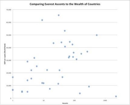
This diagram shows the expected, but nonetheless interesting, correlation between the wealth of countries and the number of successful ascents of Mount Everest from that country. Clearly this is because countries where there is more wealth are more likely to have more people willing to pay the tens of thousands of dollars that it costs to be guided up Everest. These more “representatives” on the mountain means that more people from those countries are likely to summit. But it also reveals some trends that could have deeper implications about certain countries and societies. Now, this does bring up the whole issue of the commercialization of Everest and how it has become a non-climbers mountain in many ways, and I could rant on this topic for hours, but I’ll refrain from that for now because it isn’t essential to explaining the diagram.

“The Main Sequence”

For the most part, countries fall into a moderately strong direct relationship between GDP per capita and the number of ascents on Everest. In this majority relationship, one sees countries like the United States at the very top, with a very high GDP (~50,000) and a very high number of ascents (536). The United States is a perfect example of this relationship, a very high income, and therefore a very high number of people willing to pay to “live their dream” and climb Everest. And on the other end of the main sequence, there are countries like Egypt and Armenia, both with one ascent each, and both with very low GDP’s (in the 6,000 range). Everywhere between there are countries with moderate GDP’s and a moderate number of ascents, filling out the main relationship.

“The Outliers”

While most countries fit into the “main sequence”, there are a few that fall to either side. One that stands out is Nepal, and to a lesser extent China. Both of these countries have very low GDP’s. Yet, they have high numbers of ascents (China with 299, and Nepal with the highest number: 2264). This deviation from the rest of countries can be largely attributed to proximity, Everest being on the border between Nepal and Tibet, and culture. For as long as humans have been climbing Everest, the Sherpa culture of Nepal has been a part of it, acting as guides and porters. Due to this, Nepal has a disproportionately high number of ascents when you look at their wealth. The same goes for China, although to a lesser extent. This shows that, although it has become a big part of the expedition climbing culture, money is not the only thing that matters.

The other outlier group is the countries with very high GDP’s but low numbers of ascents, like Norway and Singapore. Theoretically, there should be lots of ascents from these countries due to their wealth, but there aren’t. This raises the question of how much interest and culture play a role in Everest pursuits. For many, there is a strong desire to conquer and shoot for the highest heights, like for example the United States. That is a deeply engrained part of our culture. But perhaps that isn’t so for every nation.


Data From:

http://www.cbc.ca/news2/interactives/everest/

“List of Countries by GDP (PPP) per Capita.” Wikipedia. Wikimedia Foundation, 10 Dec. 2013. Web. 19 Oct. 2013. (

http://en.wikipedia.org/wiki/List_of_countries_by_GDP_(PPP)_per_capita#cite_note-3)

Posted in Uncategorized

The JK Diagram: American Household Income by Age and Education Level

It’s no secret that a greater education level will result in a more financially profitable career later in life.  However, one variable that if often overlooked is the age of the worker.  I was curious about how these two variables affected the income of American citizens specifically, and found an NPR article about age/income and an Infoplease article about education/income.

Due to limitations of Numbers, I was unable to successfully combine both data sets onto one chart.  Even though the y-axis is identical, the x-axis is dramatically different, which forced me to make two separate graphs.

Let’s start with the Age graph:

Untitled copy

Note that all numbers are in pre-tax dollars.

Age plays a surprising role in the amount of income that a person makes.  For example, an American adult, ages 25-34, regardless of gender or educational background, makes about $25,000-$55,000 USD annually.  To put this into perspective, this time period of their working life corresponds to the proto-star stage of stellar evolution.  During the “main-sequence”, if you will, the average American adult (ages 35-64)  income will remain very constant.  An American spends the vast majority of their working life making around $75,000 USD annually.  As a person nears retirement, likely working part time, they make only about $41,000 USD annually.  This could be considered the red giant stage of someone’s working career, before retiring to a white dwarf and making only residual income from Social Security.

According to NPR, these numbers are not surprising.  Studies over decades have shown that the peak of one’s career comes between ages 40 and 60.  While the numbers are not surprising, these are averages for the nation as a whole.  There are still plenty of people making the same money in their forties as  a 25-year-old on this graph.

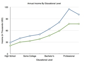
Here is the graph involving Educational Level, this time separated by gender.

Untitled 2

Note that all numbers are in pre-tax dollars.  Numbers also prevented every x-axis label from appearing due to clutter.

These numbers should not be surprising to anyone.  The more educated you are, the more likely you are to land yourself a high-skill, high-paying job.  Unlike the first graph that was an average based solely on age, this data takes into consideration educational background like I mentioned, but gender as well.  What surprises me is that women make significantly less than men do with the same degrees.  With a PhD, a women will make only about $85,000 USD annually while a man will make over $100k USD.  This means that women are not being hired for the same jobs even if they have similar qualifications since the same job will pay the same.

I hope this data has enlightened you to the importance of getting an education to secure your future.  Most importantly, ages 40-60 are when you want to maximize your potential for making money.

Posted in Uncategorized

The RS-Diagram

Untitled

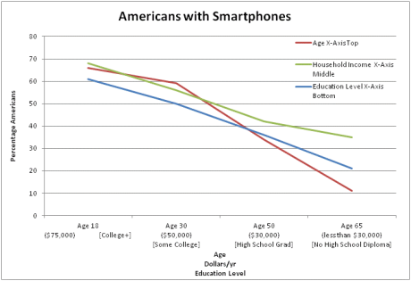
After viewing a report on smartphone ownership, I decided to create a chart with the data in the report. I documented The percentage of people who own smartphones with respect to age, Income and Education Level. Both Income and Education Level are in descending order while Age is in ascending order. These are not the only elements that the report recorded. But those seem irrelevant to the general trend. Those quantities include gender (50/50) and Race (50% for Whites, Hispanics and Blacks). One criteria that I did not include but did contribute to the trend was geographic location. But as one would expect, people in urban (48%) and suburban (49%) areas own more smartphones than those who live in rural areas (29%).

To explain the graph in its most basic form, the younger (though not younger than 18) , richer, more educated a person is, the more likely they will possess a smartphone. This should make perfect sense because smartphones is a very 21st century trend. The general population born in the ’90s experienced the development of the smartphone just as they are at their peak of learning capacity. As a result, 2/3 of the people between ages 18-29 own smartphones.

Another component to this is wealth. Let’s be honest, smartphones are quite expensive in comparison to the basic tool of communication it used to be. It has evolved a long way and can achieve a number of goals with just a few swipes and clicks. The amount of effort put in to develop this mini-computer has been phenomenal in the past 2 decades. But because of that very effort, not everybody can afford this luxury. The more wealthy a family, the more likely their child will have a smartphone. Intuitively, the level of education is also connected to wealth, more so than the smartphones even. This works both ways though. On one hand, the more wealthy a family is, the better the education their kids will receive, and they will mostly likely reward their child with a smartphone for a birthday or some other occasion, perhaps graduating middle school. On the other hand, the better of an education a person receives, the better the job he/she will get. And a better job means a better salary and income, which will ultimately lead to a more adept communications tool: the smartphone.

Even though these element show a very consistent and uniform trend, this does not mean the inverse of this trend is true. To elaborate, owning a smartphone does not make a person wealthier (they may appear wealthier), it does not make them more educated (one could argue that a smartphone is a good learning tool), and it certainly does not take any wrinkles of one’s face. So do not be mistaken. At the end of the day, education is still the ladder to the top, and the smartphone is just a small stepping stone along the way.

http://www.pewinternet.org/Reports/2012/Smartphone-Update-Sept-2012.aspx


Posted in Uncategorized

Mindfulness

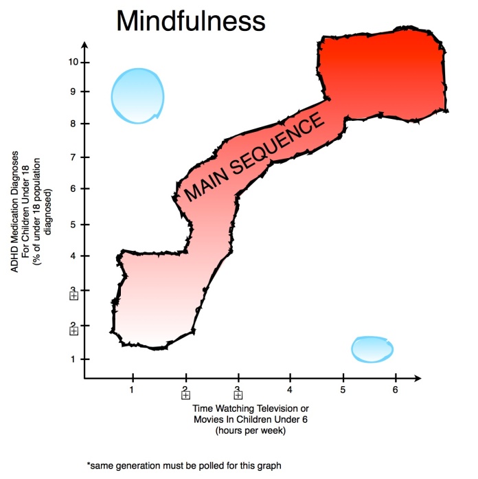
This is an explanation for the diagram I posted above. 

The JB Diagram charts the correlation between the amount of hours children under the age of six watch television and ADHD diagnoses of children under eighteen. My postulations addressing the relevance of diagnoses to mindfulness is ruthless and holds little scientific water because I did not have time to collect data. This graph represents the beginnings of a hypothesis. I repeat, I did not perform any scientific polling  or data collection method! Therefore, the generalized plot points in my graph, represented my the shaded shapes, are not supported by actual data. I skimmed charts and graphs on the internet for about two hours. Then, created this generalized and hypothetical diagram.

The intent of this diagram is not that of a thoroughly conducted scientific study. Instead, it proposes my hypothesis that television viewing in babies and toddlers is a major factor in the development of Attention Deficit Hyperactive Disorder. The brain does not stop developing after the age of six, but the years before six are some of the most formative in cognitive and social cranial development. Sticking a baby or toddler in front of the big screen is a short term solution, maybe to reduce parents’ stress, but it has dangerous implications as the child ages. Watching television is a mindless activity, unless you are analyzing a show for dramatic qualities or taking notes on a PBS special. Certainly, no child under the age of six engages in these analytic activities, making this activity completely mindless. The child becomes complicit to constant stimulation, resulting in lethargic development of crucial thinking skills.

I believe that our curiosity for understanding and interaction almost completely forms by the time we are six (or at least when we are very young). In these formative years, it is imperative to engage children in the world around them. This does not mean paying excessive attention to make sure they are learning multiplication or Portuguese. Simply, turn the television off. Let them explore the world around. Give them the opportunity to discover. If this is done, a lot of people will be saving themselves future medical bills, for ADHD prescriptions (medical meth) and more importantly ensuring complete cognitive development in their children.

Posted in Uncategorized

The Big Bang Has Left the Building

A train of thought led by the following articles:

http://www.nature.com/news/did-a-hyper-black-hole-spawn-the-universe-1.13743

http://www.pbs.org/wgbh/nova/next/physics/collapsing-4-d-star-could-have-spawned-universe/

http://phys.org/news/2013-09-goodbye-big-black-hole-theory.html

4d black hole

What you are looking at is a four-dimensional black hole, theorized for a decade or so now (although just recently gaining popularity) to be the origin of our universe.

Now I know what you may be thinking: Who? What? When? Where? How?

To understand this creation theory, we must first take a look at black holes in our own three dimensions we know and love:

black-hole-diagram

The black holes formed from our three-dimensional stars are summed up nicely in the diagram, above. The area around a 3D black hole where the escape velocity is equal to the speed of light is the event horizon, a seemingly two-dimensional surface. Once past the even horizon, one must travel faster than the speed of light to escape. Since that is not possible, the boat in the diagram would fall infinitely towards a singularity (assuming it had magical powers that prevented it from being torn apart on its journey down).

Though is that singularity truly infinite? Or, as string theorists suggest, is this singularity in the shape of a loop, putting a limit to this infinity? A loop that may be a doorway to something else… A loop maintains our 2D image of the black hole.

The “loop” idea seems absurd though let us now picture a four-dimensional black hole (like in the first picture). If a 3D black hole has a seemingly 2D event horizon, then a 4D black hole should have a 3D event horizon.

What is the point?

The theory in question suggests that the expanding event horizon of a 4D black hole is our own expanding universe.

Where is the proof?

This theory accounts for something physicists have been trying to figure out for a while, now. The uniform temperature of the cosmos would take far longer to equalize than its existence. Therefore, a theory suggesting we are a product of a longer existing universe would give us the time needed for equalization to occur.

What is the proof against it?

A 4% calculation mismatch with some new data.

Proof? Ha! This is theoretical physics we’re talking about…

So along those lines, I will leave with the product of my imagination as a result from this soup of information:

Thinking of our own black holes as 2D representations in a 3D universe, perhaps our own black holes produce two-dimensional universes? Now imagine a five dimensional universe, where a star collapses and embeds a four-dimensional apparition. Why does it appear 4D? Simply because its “singularity” is a loophole to a four-dimensional universe. Now, within that 4D universe, there is a black hole that appears 3D. Again, because the singularity transports us to a 3D universe. We have arrived to our destination.

Pretty nifty idea, but are you saying you can only go down a dimension? Can you ever go up in dimensions?

There are two logical reasons why we should only be able to travel one way. One, being time. It is linear and as we know it does not travel backwards. Two, being the desire for all particles to enter the lowest possible energy state.

Okay, sure… but what about the exits? If black holes are these big obvious entrances to a “lower energy state” then where do they exit?

Let us recall that string theory suggests (as do many others) that particles pop into existence, seemingly our of nowhere, all the time (along with their counterparts). Though what is this nowhere? Well if we take the idea of a singularity inside a black hole… The singularity would approach zero so when particles come out, they look like they’re coming from zero (or nothing).

Wow, this is all starting to make sense….

Sense? Are you kidding? I am a freshman at a small liberal arts college, just gluing together pieces of assorted puzzles, making a slightly appealing picture out of the most appealing problem in human nature.

Posted in Uncategorized

The Christian-Bladon Diagram


Image

In the graph provided, the data of general happiness on a scale from one to ten on the y-axis has been put up against year on the x-axis.  In this regard, how happy people are on average on any given year is shown from the mid-1960s to 2010.  As is readily apparent from looking at the graph, these two variables are in some way related, holding a fairly noticeable correlation line from beginning to end.  As the years have gone on, general population happiness of the average person has remained fairly steady, with points of extreme value coinciding with certain historical events of either depression or excess happiness.  In much the same way as the Hurtzsprung-Russel Diagram, happiness falls generally upon a main sequence that is a constant level of slightly higher than seven, with some years being outliers of the dataset.  This proves that happiness is not a constant, but a varying calculation on the population.  However, as data becomes more present and accessible, a slight rise can be seen in the more recent years.  Although the data is only over the course of sixty years, this rise may imply that the general happiness of humankind is increasing over time.  While this may be true, certain years have more than one set of data, while some have none at all.  This lack of a complete set of data could hold important results for level of happiness, showing more outlying years on the data plot.  


http://www1.eur.nl/fsw/happiness/hap_nat/nat_fp.php?cntry=35&name=United%20States&mode=3&subjects=5336&publics=790

Posted in Uncategorized

The WH Diagram

For today’s blogpost, our class was asked to create our own version of the HR Diagram, one of the most prominent tools used in astronomy today. If you do not know what the HR (or Hertzsprung-Russel) Diagram is, it is essentially a luminosity vs. temperature graph for all of the stars in our galaxy that we have observed to date. Some very interesting relationships can be noted between the stars on the graph (i.e., the fact that mass is clearly a deciding factor for the temperature, luminosity, life span, and other characteristics of stars), all of which are very clear since the HR Diagram has concentrations of stars in various areas, which contradicted the initial hypothesis that stars would be randomly scattered throughout the graph. The HR Diagram is actually very interesting, take a look here:

hrcolour

The HR Diagram, which compares stars of different types and shows some striking conclusions

In an attempt to recreate the HR Diagram with different variables that happen to have similar relationships to each other, I researched the example of poverty vs. obesity, since the two are clearly related. Here is what I came up with:

A graph comparing the relationships between socioeconomic status and obesity levels

A graph comparing the relationships between socioeconomic status and obesity levels

To understand my WH Diagram, think of it in 3 different sections – poor, skinny dudes, the main sequence (which was not given a euphemism because it scales the entire graph and therefore all socioeconomic levels), and the rich, which I separated into two sections, well-off big-guys and wealthy fat-guys. Although I did not use specific values to create my graph and instead used general descriptions like “lower class” or “obese”, there are still certain relationships between socioeconomic status and obesity that the graph highlights.

Let’s start with the bottom left area, where the poor, skinny dudes reside. Here we see a relationship between the underweight and the lower class. Why might this relationship exist? The answer to this one is easy; people who cannot afford enough food probably will not have too much weight on their bones, simply by virtue of the fact that food does cost a considerable amount of money. It is hard for someone to prioritize their health if they cannot even afford a place to live. It is important to note here that the reason these people are so skinny (and probably unhealthy) is because they do not actually have enough money to purchase food to eat. While this may seem obvious since I have repeated it so many times, this is key because if you take a small step up in the socioeconomic ladder – where a family can afford food, but only particularly unhealthy food like McDonalds or Burger King – this family will actually be more overweight than your average family. So, although poverty generally implies some level of obesity, if a person/family is too poor to afford any food at all, then they will likely be very underweight.

The next section, the main sequence, is also simple to understand. The more wealthy you are, the more healthy food you can afford. This is interesting because although wealthier people will likely eat more food since they can afford it, they are not generally overweight because the food that they are eating is healthier. Take a look at this picture for an example:

In almost every section, Whole Foods is more expensive

In almost every section, Whole Foods is more expensive

It is evident that Whole Foods is almost always more expensive than its competitor, but why? The answer to this question lies in the fact that when people go to Whole Foods, they are willing to spend more because they want to buy organic foods, which are healthier alternatives to non-organics. So, if you can afford to buy food at Whole Foods, you will probably be a healthier person, but you need to spend more to achieve that health.

The last section is the rich, separated into two groups: wealthy fat-guys, well-off big-guys. The distinction between these two sub-groups is not particularly necessary, I simply included it to show that there are different levels of over-eating. This “rich” section is a bit of an outlier because it stems from people who have so much money that they over-eat to a point where they are obese. Whether these types of people are eating organic foods or not since they can afford them (which is probably unlikely since their preferred dinner consists of a big, fat, juicy steak), if you eat enough food, you will be overweight, it is as simple as that. Most people do not even have enough money to afford to eat this much food, but for those that do, they should be wary of ending up on the top right of my WH Diagram.

Anyways, the overall trend of the WH Diagram should be clear – the less money you have, the lower quality of food you are able to afford, and the more overweight you probably are. I have noted that there are certain groups that lie off of the main sequence for one reason or another, but all of these outliers can be explained in some way.

Posted in Uncategorized