In these past couple of weeks, we have finally begun curating our gallery! To begin this process we went to the museum and each picked a featured exhibition to explore and dissect. With a graphic organizer and maybe a partner or two, we looked at how curators and artists come together to convey a central theme of an exhibition. For this exercise, I explored the exhibition, Raizes and Roots, which focused on Brazilian culture and the ways in which it has been misrepresented. This was an incredible exhibition to look at, in part, because of the innovative ways in which the works of art were arranged. Toward the rear of the exhibition, drawings hung from the ceiling by thread and were surrounded by beautifully cut tissue paper. Seeing this innovative set up, my partner and I were able to see not only how a certain work of art can shape the trajectory of an exhibition, but also how its location within the space impacts the viewer’s experience. We left with a greater understanding of how to convey a unifying theme through many different mediums.
The days preceding and following our gallery visit were spent flipping through slides and looking more closely at certain objects from the museum’s large storage area with Jessica Hunter-Larsen. We jumped back and forth from theme to theme but finally settled on one surrounding identity and how it is created and shaped. By narrowing down a theme, we were able to go from looking at objects and judging them based on aesthetics to really considering their purpose and message. We were really starting to make progress!
Some pieces jumped right out at us and we knew collectively that they had to be included. On the other hand, some took a little more time to figure out. To help us with our decisions, Jessica took these objects out of storage and let us have a look at them. This close-looking exercise changed everything. We could see sizing, proportions, color, and so many other compositional elements that weren’t translated well through a photo in a PowerPoint. After noting what would and wouldn’t work, we printed out all of the pictures and begin mapping out the gallery.
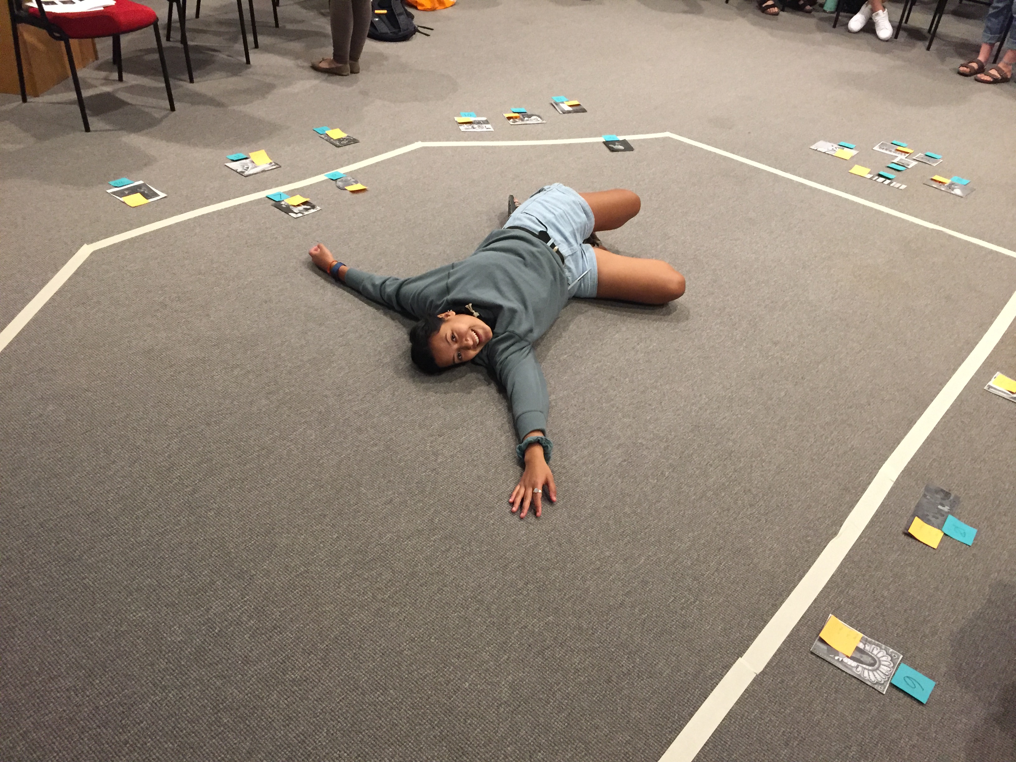
Since our gallery is oddly shaped (there are six walls to work with), we had to pay close attention to sizing. This was hard considering we were working with printed black-and-white photos that weren’t similar to the actual works of art at all. Still, after numerous MTV Cribs jokes and references to the Real World, we were able to turn our taped floor into a mock-up of the gallery. As a class we experimented with different placements and the use of sculpture within our exhibit. Although nobody got mad, there was some heavy debate over whether aesthetics or theme are more important when grouping pictures together — something we are still exploring as a class. Being able to have this taped-up model was extremely helpful and fun because we were able to truly begin visualizing what our gallery would look like. It was becoming so real! After experimenting with salon walls, sculpture, and varying wall placement, we were able to agree on a basic layout for our gallery. Over block break, Jessica Hunter-Larsen and her team hung our objects in the space. Stay tuned for updates on how it all turned out!
