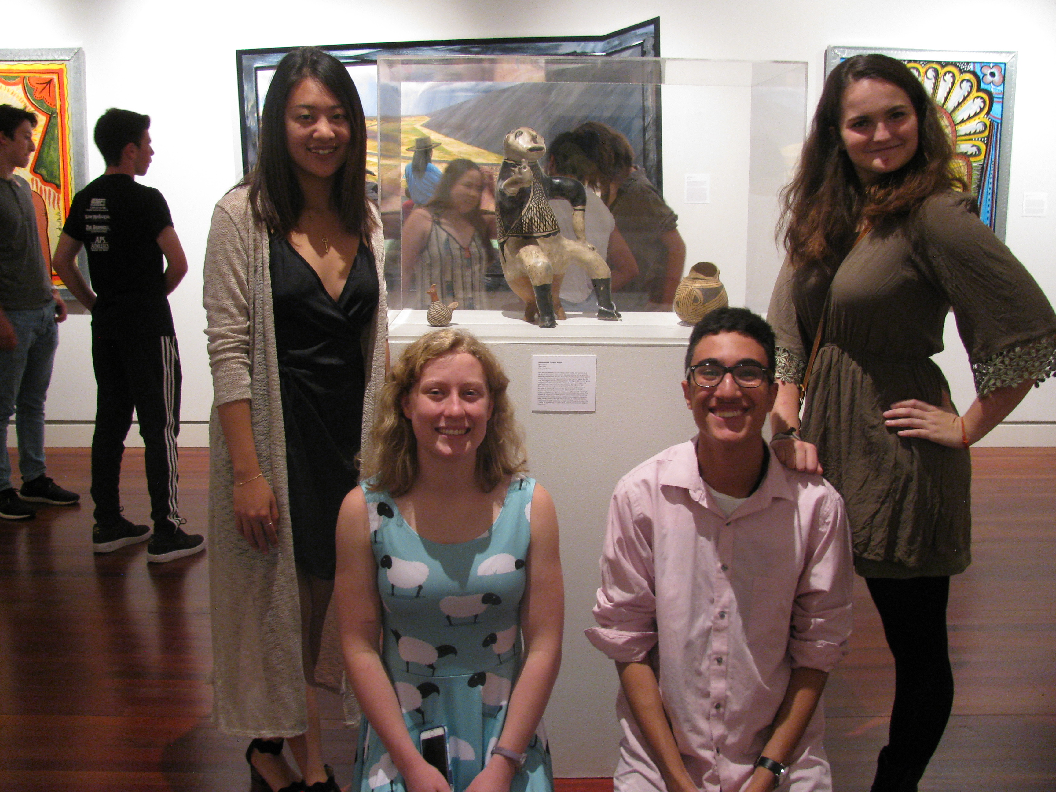
After all of our discussions and planning, our chosen works of art are officially up in the UnBlocked Gallery! I was anxious to see how it all turned out, especially because it was set up while we were away on Block Break. Our class stopped by to see how everything turned out, and it was amazing to see how our ideas translated into a real space! Seeing all of the works in real life rather than in a two-dimensional picture completely changed how I thought about each of them. I was able to see so many small details that I had missed before, and the texture and feeling of each object was much more accessible to me when I was able to stand directly in front of a work. Despite our best efforts, we couldn’t fit everything into the space. Planning it on the floor of our classroom was much different than actually seeing the objects together in real life because the reproductions we had been working with were not printed to scale. Many objects that we chose were much bigger than we expected, so we were forced to really think about which pieces we wanted to include. Because of the limited space, certain works had to be cut, and we were left with those objects that really emphasized what we wanted the viewer to think about when experiencing our exhibition.
Even though we didn’t get to include everything that we had hoped, I was glad that we came across this obstacle. It taught me so much about the job of an art curator. Before taking this class, I had not given much thought to how much work goes into putting an exhibition together, but our professor, Victoria, and Jessica Hunter-Larsen of the FAC Museum at CC, have shown me that it is actually a very complex process. Each object not only plays its own role within the exhibition, but it also affects how the viewer will think about all of the works positioned around it. Because of that, our class had to think very carefully about how these art objects would speak to one another if we put them close together and whether the message that we created with a particular arrangement supported the theme of our exhibit. Thus, we had to consider where in space we wanted to situate the works and how this arrangement would affect the viewer’s understanding of the composition. For example, we originally considered lining up three of the works in a step ladder pattern, but Jessica Hunter-Larsen pointed out that using a decorative set up just for aesthetic purposes could cause the viewer to focus on the organization of the pieces rather than the content of the works and the ideas we were trying to convey by putting them together.
Even though I have already learned much about this process, we still have a long way to go. Our last trip to the museum was spent selecting individual works to examine. We have each chosen one to two works of art for which we will write a short label that will be placed on the wall for the benefit of the viewer and then write a longer summary that will be available for visitors who would like to delve even more deeply into the exhibition. As a class, we are currently making decisions about what type of labels we would like to write, and must write an introduction to explain to visitors the theme that we are exploring. Clearly, there is a lot left to do before our opening reception, but I am excited to learn more about the works we have chosen, and to begin the next steps in completing our project!
