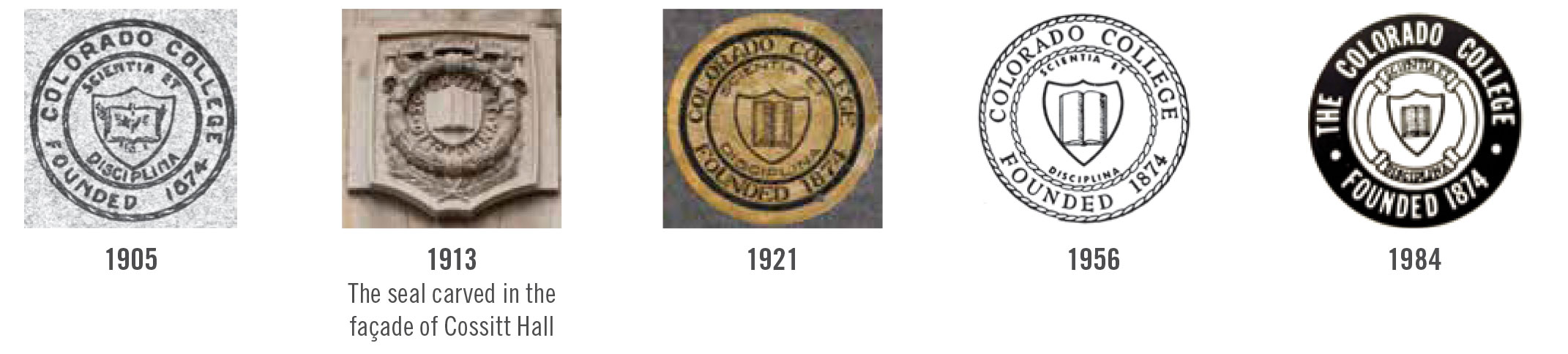
1905-1988: The College Seal
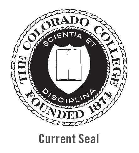 For more than 80 years, the college seal was the primary identity mark of the college. It first appeared on the 1905 college course catalog cover, but other information about its origin remains a mystery. It was common, however, for colleges and universities to adopt similarly designed seals in the early 20th century. The design of the college seal has been altered slightly over the years.
A few iterations appear here — but the main elements of the book, shield, and the college motto “Scientia et Disciplina” (rough translation: “Learning through Hard Work”) have remained the same. The seal is still used today for historical identity, achievement documents, academic recognition, and official business of the Office of the President.
1989-1998: The Cutler Cupola and Athletics Tiger Logos
 In 1989, the college created a completely original logo to express the identity of the institution. The logo was intended to modernize the brand of the college, as well as to identify the college in a much different manner than the seal. It incorporated the bell tower at the top of Cutler Hall as a recognizable architectural reference contained in a shield design (a traditional academic symbol). “The” was added to the college name in the 1980s to help distinguish the college among other institutions in the state. The CC athletics logo featuring the tiger mascot was designed at the same time and is still in use today.
1999-2009: The Linking Cs
 The main college logo changed again in 1998 in order to address new communications goals. The new logo expressed the qualities of the college as a historic institution (represented by the calligraphic linking Cs), as well as one that prepares students for modern challenges (represented by the rectangular gradation). It also prominently featured the college colors black and gold, and incorporated the college’s inception date of “1874” to communicate the college’s prominence as a long-standing, national liberal arts institution.
2010-PRESENT: The Wordmark
![]() In 2010, all graphic elements were stripped from the linking Cs logo except for the college name. Like many contemporary higher education institutions, the college currently lacks a distinct visual mark and uses only a typographic letter design as its visual identity. Created in Stone Serif — the typeface that the college has used since the 1989 logo — the wordmark clearly and simply identifies the institution as “Colorado College.”
In 2010, all graphic elements were stripped from the linking Cs logo except for the college name. Like many contemporary higher education institutions, the college currently lacks a distinct visual mark and uses only a typographic letter design as its visual identity. Created in Stone Serif — the typeface that the college has used since the 1989 logo — the wordmark clearly and simply identifies the institution as “Colorado College.”
2016: New Year, New Look
 As part of the college’s strategic plan, CC is developing a new institutional logo that unifies our brand, helps CC stand out among other institutions, and strongly conveys the three main brand aspects: its pioneering Block Plan, CC’s place in the Rocky Mountain West, and the creative people who make up the campus community. The new visual brand will be launched in early Spring 2016.